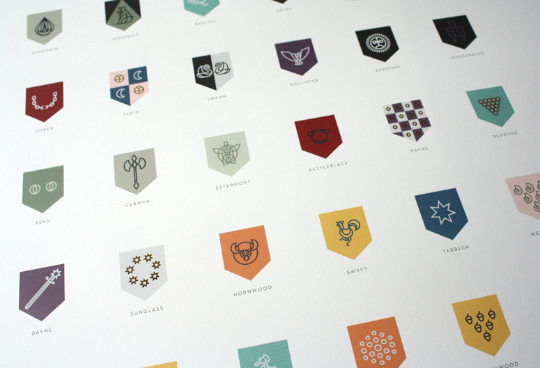
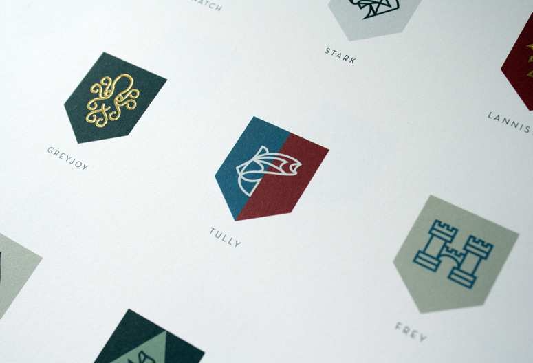
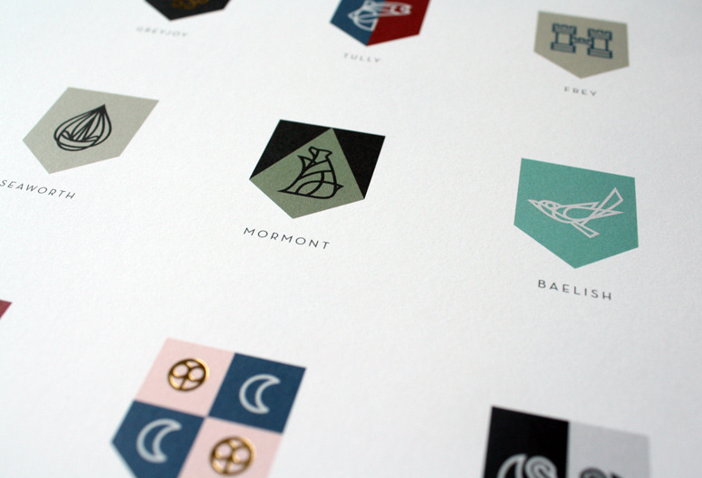
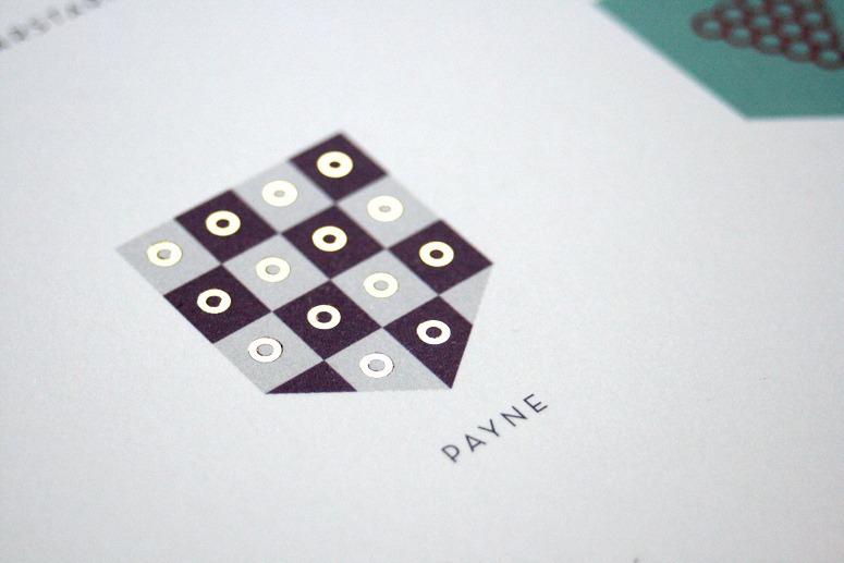
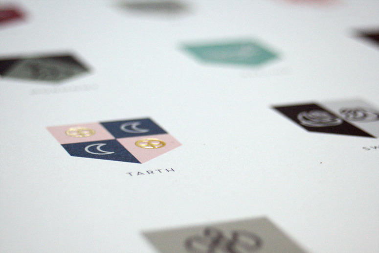
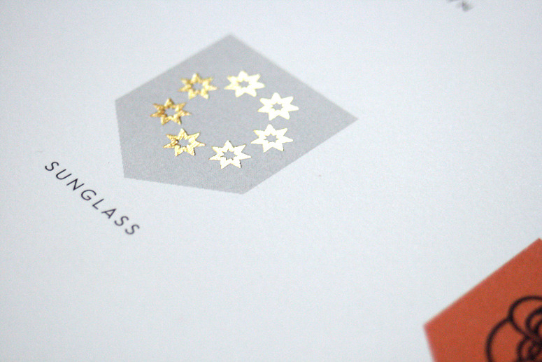
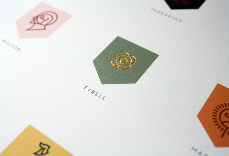
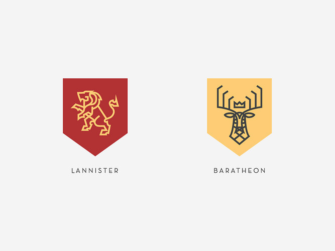
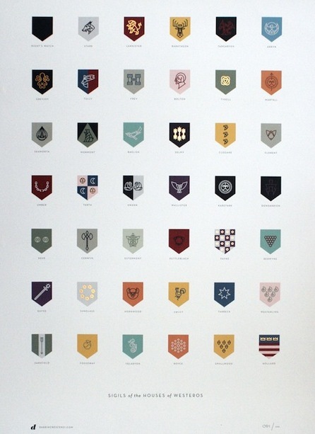
After getting sucked into the Song of Ice and Fire series of fantasy novels by watching HBO's "Game of Thrones," Nike designer, Darrin Crescenzi, became intrigued by author George R.R. Martin's in-depth descriptions of each major character's heraldry, and the ways in which their symbols seemed to establish a "brand" for each of the story's families. He ended up crafting an icon for each one of them. It's beautiful.
“Like many people, I was introduced by the HBO adaptation--I’m sure to the chagrin of the longtime readers. I began reading the first novel while watching the first season, quickly becoming hopelessly obsessed. I basically disappeared for about five months, devouring all five books in the series, culminating in this borderline-depression when there were no more books to read,” Crescenzi tells Co.Design. “I’m not entirely sure of the full impact the books had on my social life, but there was definitely a span there where friends stopped calling.”
But unlike the rest of us, Crescenzi didn’t end his obsession there. He’s a branding expert, after all. Logo and typographical designs are what we eats, sleeps, and breathes. So while he devoured the books, he also kept a notebook at his side, recording the text descriptions whenever George R.R. Martin introduced a new house sigil. By the third book, Crescenzi stopped taking dictation and began drawing the sigils then and there, eventually compiling the whopping collection of sigils you see here. “I didn’t brand each house--George R.R. Martin did, and whether or not it was intentional, the result is an integral piece in the success the series,” Crescenzi says. “All I wanted to do was give them a sort of unexpected and unified visual language.

